|
Toasty AwardsBrand Identity | Guidelines | Collateral | Website UI
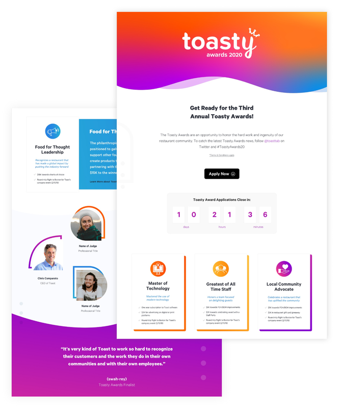
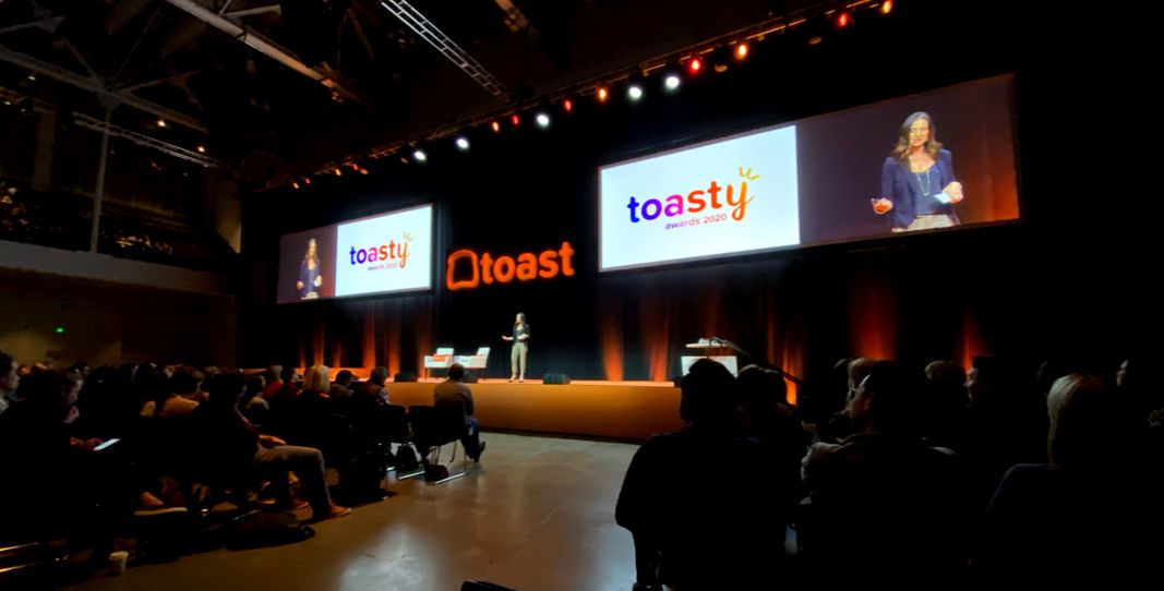
"Celebrating the hard work and ingenuity of our growing restaurant community" The Toasty Awards are annual awards given to Toast customers. Both restaurateurs and customers can nominate restaurants, and a panel of judges narrows down the finalists, which are awarded at Toast's Kickoff. This year, the brand needed to reflect our loved and celebrated community, so I took on the challenge of encompassing the awards' mission to visually encapsulate the brand. I developed the Toasty Award Brand Guidelines, which were scaled to a site where customers and employees could nominate restaurants during a specific window of time. After this, finalists were narrowed down and anyone could send in their votes to nominate the winners. This year there were over 800 applications sent in for four awards compared to last year's 400 submissions.
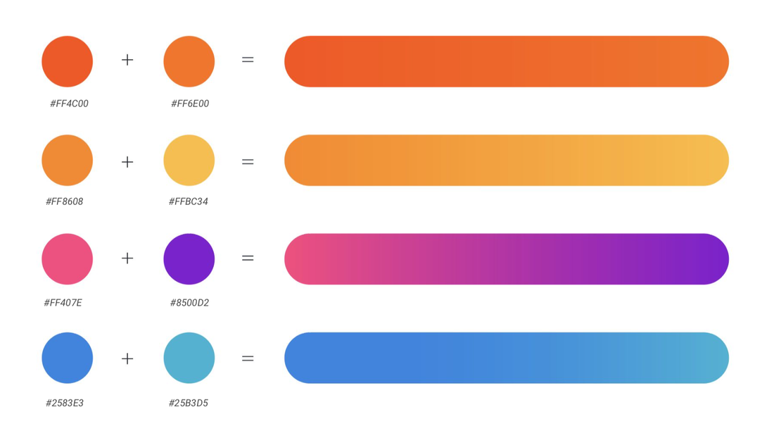
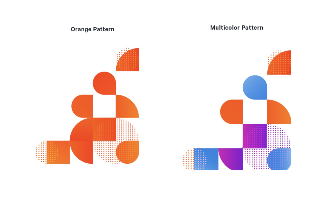
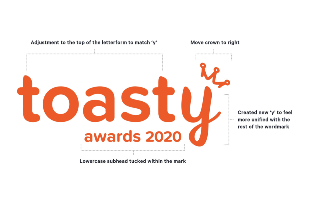
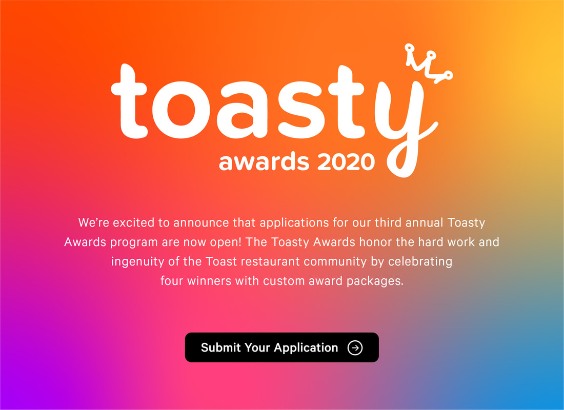
We adjusted a few variables from the past Toasty logo to enhance the quality and usability of the logo. We have moved the crown to the right and have eliminated the bread slice completely to simplify the amount of new elements. The new ‘y’ matched the weight and feel of the rest of the word, while bringing it’s own flair, which we have matched appropriately by adjusting the top of the ‘t’s’. This gradient capitalizes on two of our primary brand colors, while introducing several new tones to highlight the diverse and vibrant restaurant community that we work with and create content for on a daily basis. These colors come together to form our color palette. |