Haley Longbottom
  • Work
  • About Haley
  • Resume
Picture
Picture

(Acquired by Doordash in March 2022)


UI / UX Design, Visual Design, Branding + Identity, Marketing, Product Design

As the first UX designer to join the SaaS hospitality startup, Bbot, I had the opportunity to develop a design system for the company, work cross-functionally with marketing, engineering, and product, as well as create a vision for the future of hospitality. 

Order + Pay | Owner Portal

Picture
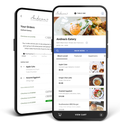
Worked with product and engineering teams to create a more seamless experience for guests to engage with restaurants when ordering digitally.

Brand and Logo

Picture
Transformed the face of our company to reflect our modern mission and values. Created a space in the market for our brand.

Website Redesign

Picture
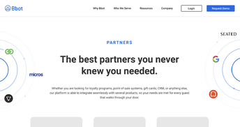
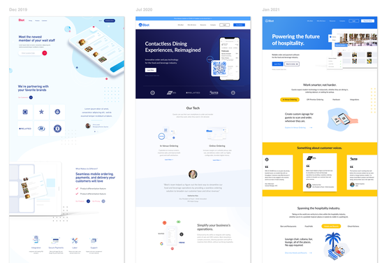
Created a sleek, new look for the 2.0 and 3.0 versions of our marketing website to match the high quality product.
In 2020, we refreshed the entire website, including but not limited to messaging, visuals, and brand guidelines. Along with the initial redesign, I created a whole new logo to better align with our mission, goals, and values.

Below are the breakdowns of some major initiatives I have led while at Bbot.
Picture
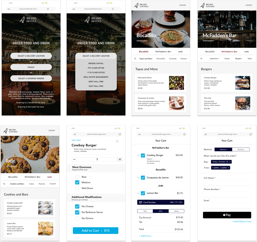
Branded Ordering Mockup Screens for Marketing
Picture
Evolution of Website

Website Redesign

Picture
Website 
(Launching mid-January 2021)

 The Problem:
Customers were not taking our brand seriously. As an emerging leader in contactless technology, we were represented by a cartoon robot logo, and a website that was described as "clown-ish." 

The Big Question:
How might we create a new brand look and feel for ourselves that echoes our approachable yet sleek product with a scalable foundation to ultimately transfer to our product?

The Solution:
After looking through competitor sites, polling employees, attending sales demos, and implementing some initial marketing campaigns, we were able to gauge how to best position our product to our customer base. Finding a bridge between professional, down-to-earth, while keeping our expert mentality would help dictate the visuals that would encapsulate the brand.

Consumer App


​The Problem:
Many competitors are surpassing the Bbot product on the basis of visuals and functionality. The engineer-designed consumer app was falling behind with the sleek nature of delivery, in-venue, and order ahead products and applications.

The Big Question:
How might we refresh the look and feel of our consumer app to increase functionality, kickstart the way we think about ordering from a phone or computer, and have a cohesive design system across products? 

​The Solution:
This was the first release in our journey to improving the way consumers order from their devices. With competitive analysis across seven order-type apps and products as well as user testing, the team was able to spec out a product that would surpass the current one in speed, visuals, and functionality. Native experiences allow ease of use, and the introduction of a new design system allows hospitality operators to customize differing variables across their branded ordering site. 

Logo

Picture
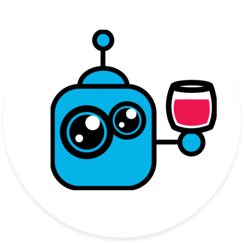
Current Bbot Logo
Picture
Original Bbot Logo
Picture
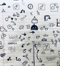
Sketches for logo redesign

The Problem:
The logo was a cartoon 5-color robot that was created at the beginning of Bbot's history. It was cute, but did not necessarily reflect how we wanted to see ourselves when it came to pitching the product to investors or mid-market to enterprise prospects.

The Big Question:
How might we develop a simplified icon for our logo that conveyed our company's purpose (including hospitality, robots, and the food and beverage industry)?
​
The Solution:
After much sketching and iteration, I landed on a mark that included the iconic bell shape that one might see when at a hotel front desk. This shape doubled as a cloche, furthering the hospitality imagery. All of this and it's bot-like resemblance combined to create a logo that could scale with the hyper growth of the company.

Owner Portal — Product


​The Problem:
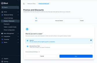
Users are not able to properly onboard with ease as they set up the product for their restaurant. Understanding where they were in the process and what the task at hand was was key. Along with this, the owner portal was full of endless lists with information that was not essential.

The Big Question:
How might we set up a scalable view in the owner portal that could help users see where they were in the onboarding process AND how might we create a view that could translate to several screens when displaying excessive information?

​The Solution:
This project was two-fold — making users comfortable in the initial process, all the while presenting the information in a digestible format. Before diving into the customer journey wizard, I jumped into the owner portal screens that had infinite scrolls, where I worked with engineering and product to implement a card view to manage locations, printer statuses, and other elements of their setup. Afterwards, we ventured to the onboarding process where we introduced the left side-bar that indicated the different stages that a user was in the process. 

Work

Bbot Order + Pay
Toasty Awards

Food for Thought
Hive Mobile App
Rally for Restaurants
Success Report
​Toast Assets
Branding
StarVista
CRISPR

About

Contact
Resume
© COPYRIGHT 2022. ALL RIGHTS RESERVED.
  • Work
  • About Haley
  • Resume